


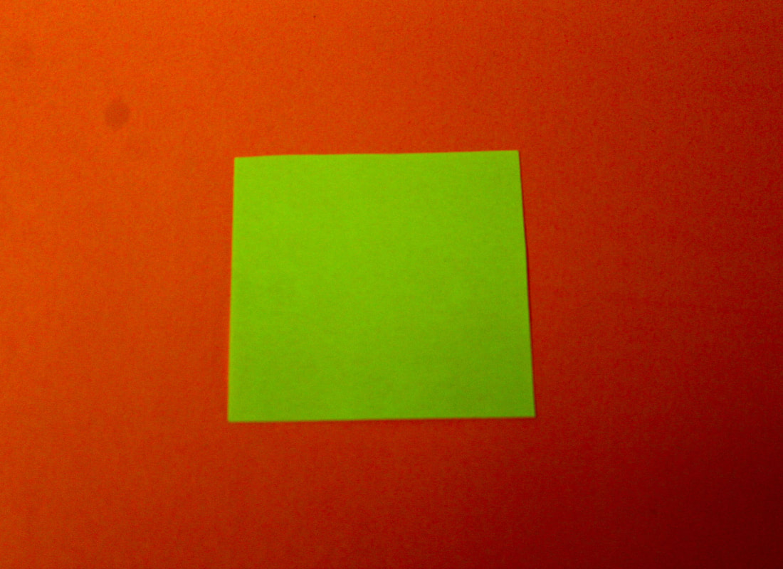
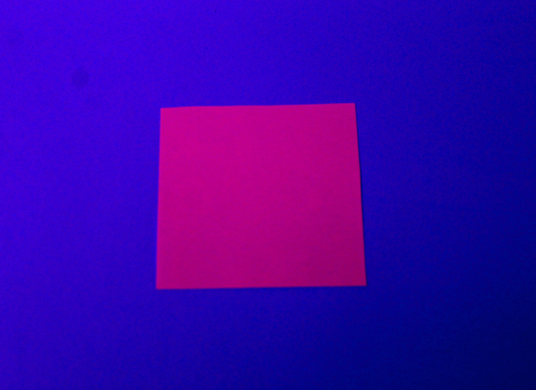
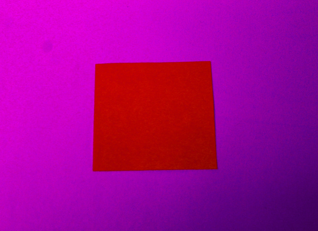
White paper abstraction
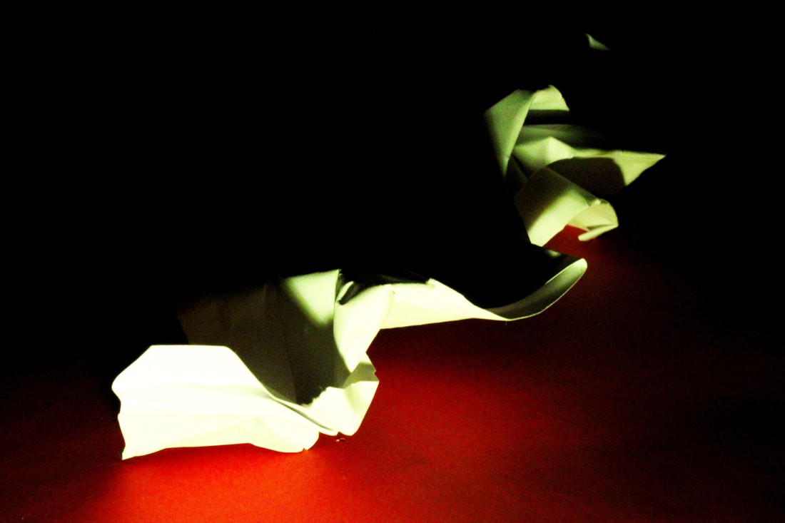
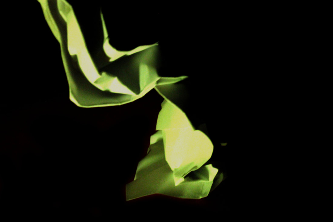
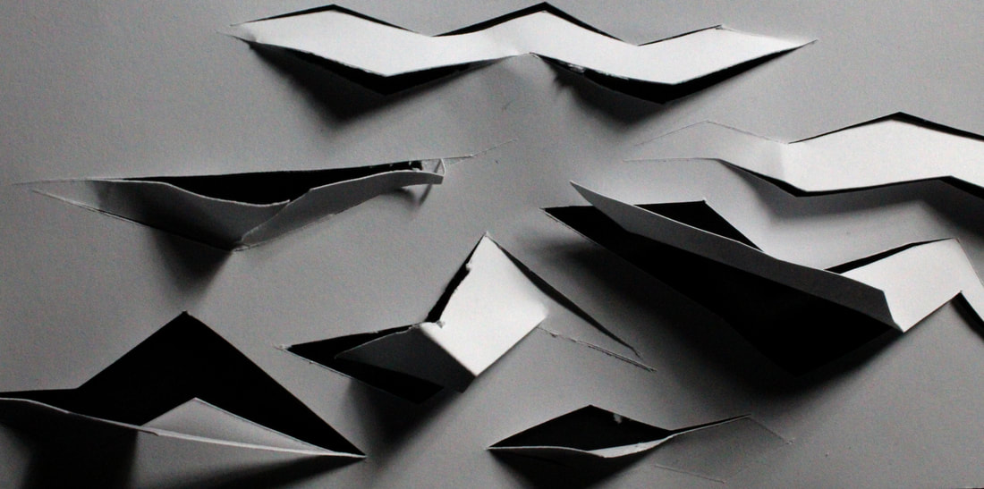
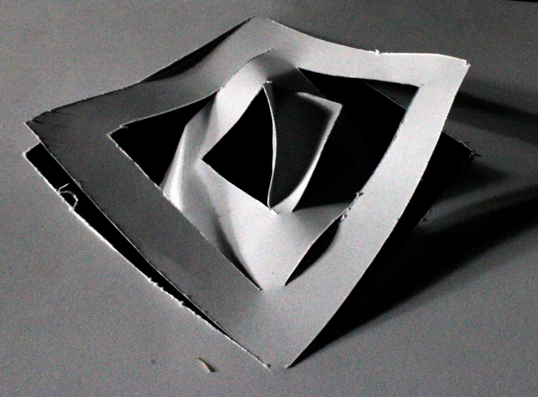
For the first step of abstraction, we each had one sheet of white paper in which we could contort and shape in many different ways to create interesting abstract images and shapes. To begin with I just curved the paper and played with colour. After a few of these I began to fold and scrunch the paper, studying the details in each crease.To add colour to the picture I used clearblocks of colour to place over the light, so it is reflected onto the paper.


My best edits are where the paper is in an interesting shape because the shadows also frame the piece nicely. I had a coloured backdrop for these images because I felt it made the paper stand out and look like a piece of art rather than just folded paper. It also creates a three dimensional feel to the image because the studio lights add perception with contrast of light and dark.

|
|
|
|

|
Tamara Lorenz
|
|
Tamara Lorenz creates various constructions which she then photographs to exploit their abstract properties. The addition of strong planes of colour provide another source of contrast in addition to those of line, shape, tone and texture. Rather than photographs of things, each image seems to create its own reality. Consequently, the viewer is unable to recognise a conventional subject and is occupied with the business of looking.
|


|
|
|
|
|
|
|

|
|
|
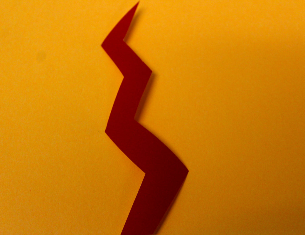
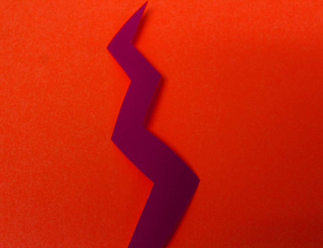
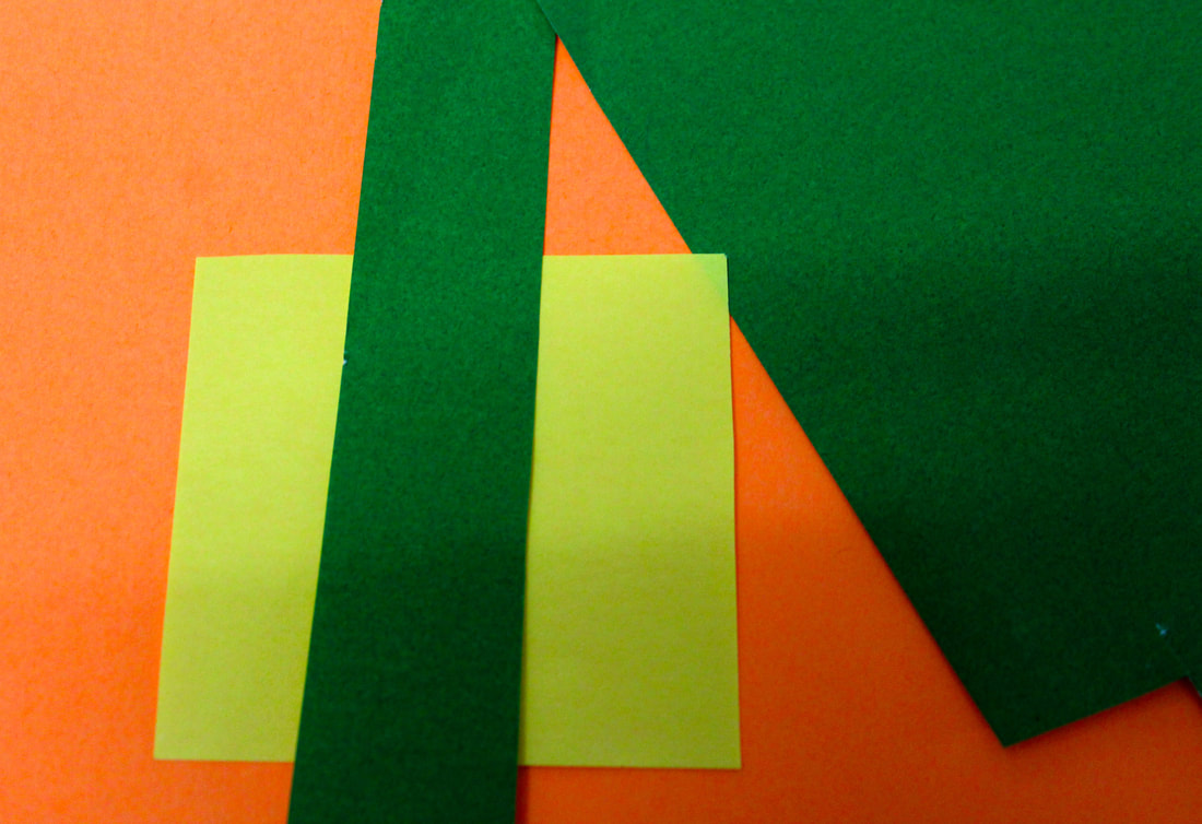
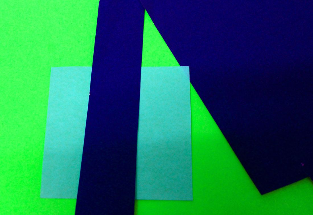
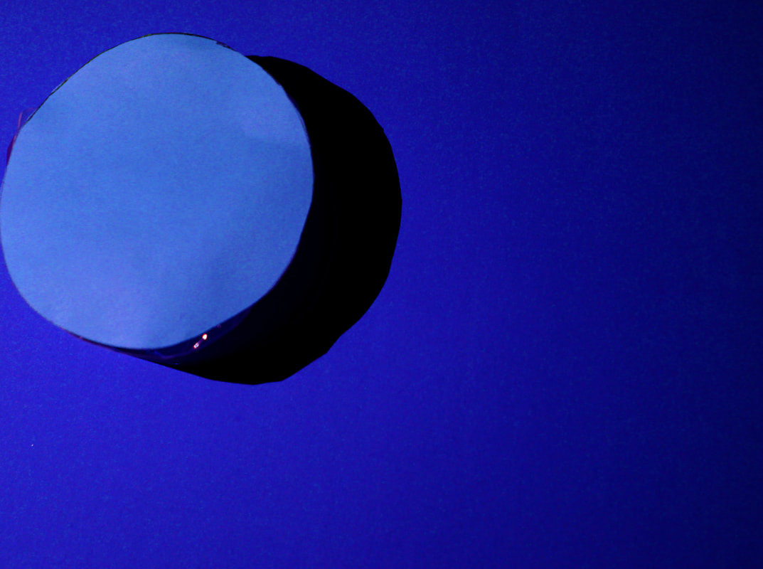
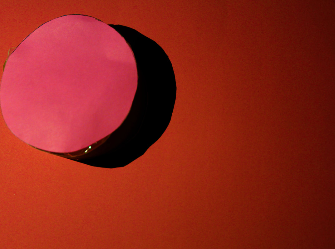
To mimic the work of Lorenz, I gathered pieces of coloured paper and card and cut out interesting shapes, I tired to contrast block colours. I like the images where the cut-out card creates a shadow on the backdrop so when taking the pictures i used my phone torch to extenuate the shadow. Then in photoshop I edited the vibrance and hue so that the images would be vibrant similar to Lorenz's work. I also played around with changing the hue of the image to see what different colour combinations I could make. The images are on the left are the original photos and the others have edited hues. Once edited the images became more vibrant and the different shades draw the eye in. To improve my images I think the shapes could have been more complex and three dimensional.
Francis Brugiere


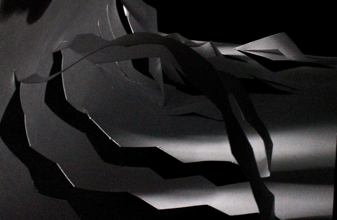
Francis Brugiere was an American photographer who moved to London in 1928 where he began to experiment with non representational photography. Of these, the cut paper abstractions are particularly beautiful. The photographer exploits the endlessly subtle. qualities of both paper and light, manipulating both in order to create complex patterns of texture and form.
|
|
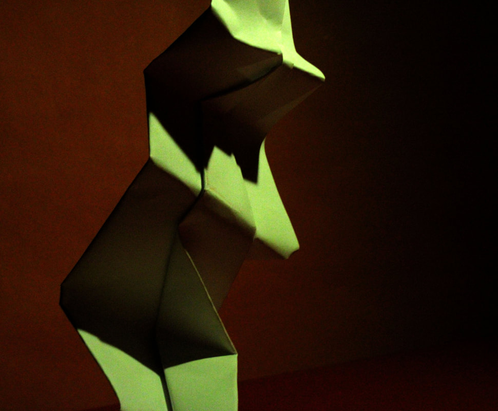
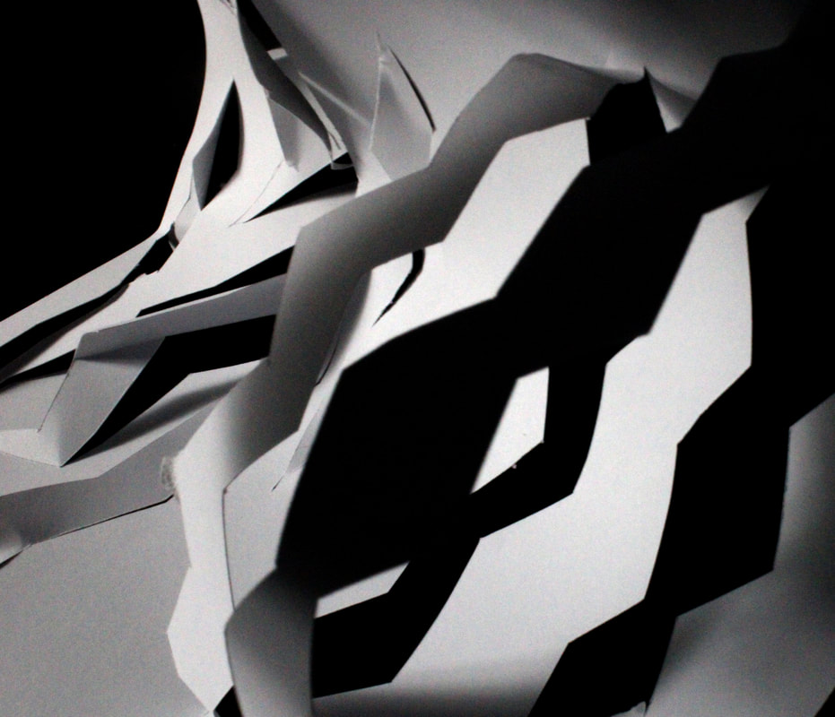
To develop this project we looked at artists such as Francis Brugiere who used abstraction of paper to create shadows and 3D shapes. To mimic his work, I used a Stanley knife to cut shapes out of white paper that would pop out and be eye catching. I used a black background so the gaps and shadows would blend in and a bright white light so that texture was highlighted. Below are my edited photos. I think they were successful because I created different shapes and shadows that made abstract images. To improve my images I think I could have used different, flickering lighting to the image is more unclear and it is not obvious the shapes are made of paper.

|
Final Edits
|

|
|
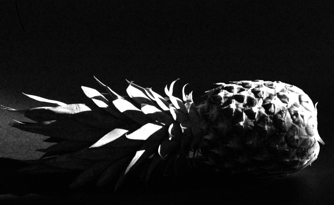
I think these images were successful because they depict the texture of the different items. The shadows created an abstract feel to the images which makes it harder to tell what the image is of, reflecting the work of Ed Weston. The images could be improved by a greater contrast given that the images are in black and white there would be a greater metaphysical feel.
Body and Nature
Alicija Brodowicz
Inspired by Brodowicz I first looked in the nature aspect of my local environment particularly studying forms that resembled parts of the body or interesting shapes that could be close up features, below are the images that I took.


Below are my best edits which I matched up to parts of the body that mirror one another. When taking the human images I had to keep referring back to my nature pictures to ensure the angles were the same. I tried to make the body look ambiguous what was being captured and where lots of detail could be included. I made the images to black and white like Brodowicz so there was less information in each image and they could match up more easily. I think my most successful images were those where lots of details was captured in both nature and human, as it gets you to look further into similarities of things you may see everyday.
Ambiguity
Johnny Kerr


Street photography
Stephen Calcutt
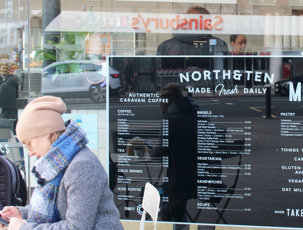
In my attempt to mimic Stephen Calcutt's work, I explored my local area looking for graffiti and scratches in glass bus stops. This creates a damaged foreground which can highlight some of the less glamorous parts of high streets, creating a more honest form of street photography. I stood behind the glass waiting for people to walk past to frame the image. It was essential that people did not know they were being photographed until after so the photos did not look forced or candid. I had to set the aperture higher so that although the bus stop glass was the focus for the image it still captured all of the background clearly. This task challenged me because only had a split second to capture people walking past so had limited time to frame the images. Below are my best edits-
I think these images were successful because they captured a raw sense of people completing everyday tasks. The scratchings on bus stops caught the light in the dents of the glass which adds texture and depth to the images. The top two photos I colour balance in Photoshop, heightening the greens, in order to make the images look more analogue. I think those images were my most successful because the foreground of the bus stop graffiti is fully focussed, while what is captured behind the glass is more blurred, but still fully depicts the scenery around. I think that the images below, although capturing a raw depiction of people, the background was too busy so there is no clear focus of the image. Also the markings of the glass were not as clear focus so some reflection was captured and the photos became more ambiguous with less of a focal point.
Saul Leiter
|
Saul Leiter was an American photographer in the 40s and 50s who recognised New York as the base for street photography.He photographed in colour using slide film such as Kodachrome which was revolutionary for his time. He particularly excentuates the reds and yellows of his images which creates a sense of life, capturing the busting streets. His images are framed in an abstract way so that it captures more of a feeling rather than an exact depiction of the scenes
|
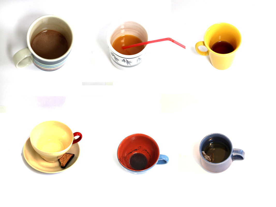
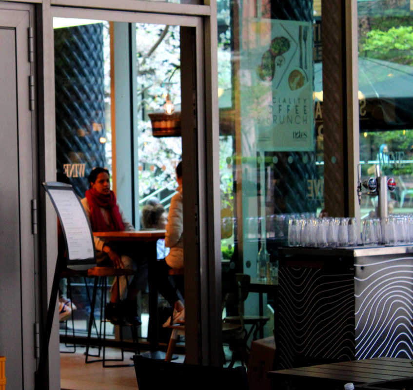
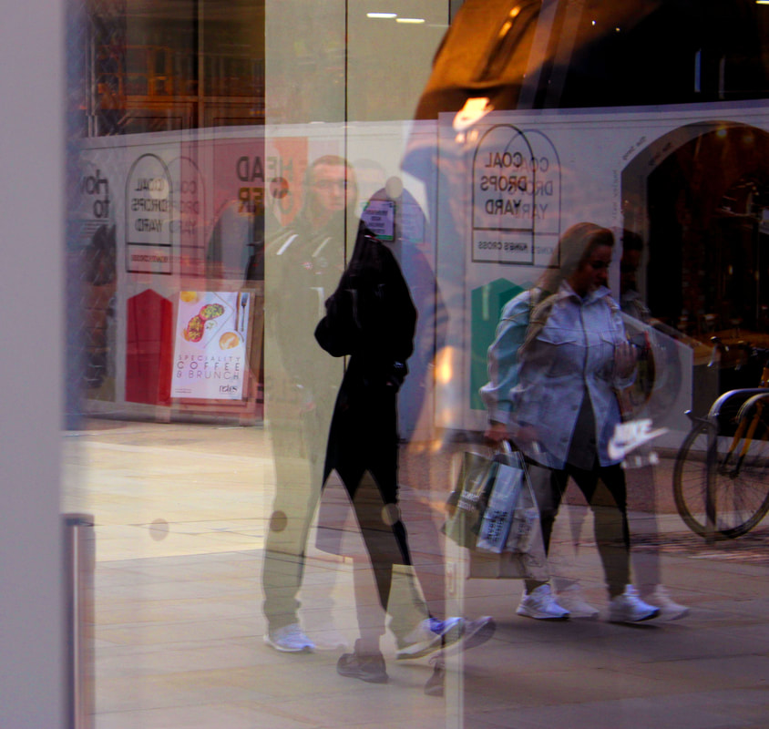
In my second development of this task after looking at the work of Saul Leiter I looked for frames that were more planned, possibly creating a more aesthetically pleasing, nicer depiction of my local area. I went around looking for shop and cafe windows, trying to capture both the scene inside, and the reflection through the window of outside on the pavement. I tried to look for people sitting close to the window so there would be a clear contrast of what's inside and the reflection outside. Saul Leiter also uses colour to extenuate the shapes and warmer tones that make the images seem more homely and inviting. I found it difficult to place myself in the right angles where the reflection would be noticeable without being distracting whilst simultaneously getting a good frame of the people inside.

|
These images were successful because I think it caught people in their natural environment whilst still creating a complimenting structure using windows or doors, adding the reflection. However I did find every person I tried to photograph was on a phone or laptop. This doesnt capture the full sense of humans like Saul Leiter does because there is no emotion besides concentration. I think my most successful images are the two at the top because the people sitting against the window creates a clear image of them while capturing the reflection of outside. It makes a juxtaposition of the cozy cafes and the cold bustling scenes of the outdoors.
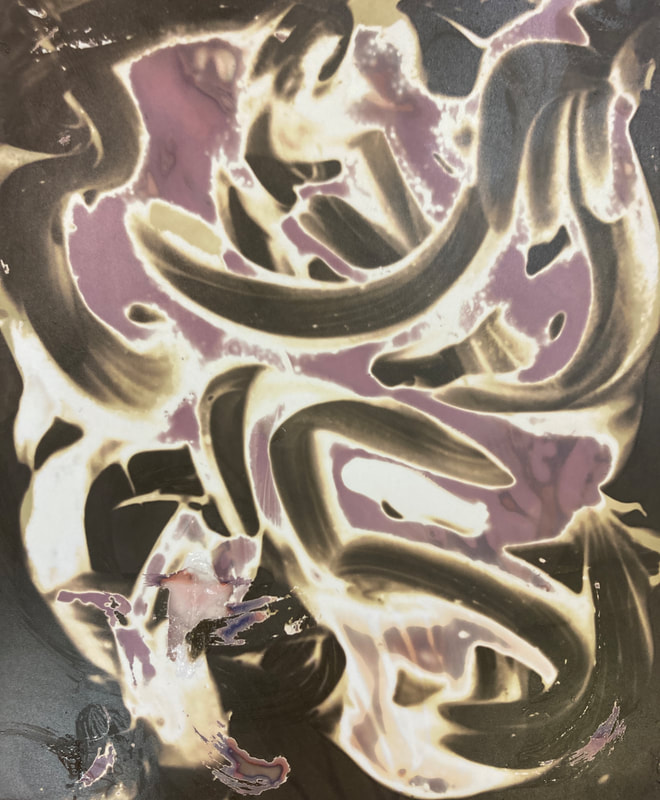
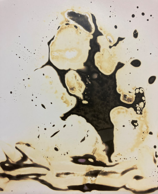
Chemigrams
The chemigram process was developed in 1956 by Pierre Cordier. He discovered that you can use a resister to hold back the chemical effects of developer and fixer on a piece of black and white paper. We used this theory to play with different elements to see what shapes and colours we could form in a chemigram.

|
|
|
Independant development
Next I developed abstraction further, looking closer at the aspects I found most interesting, I chose portraiture and street photography.
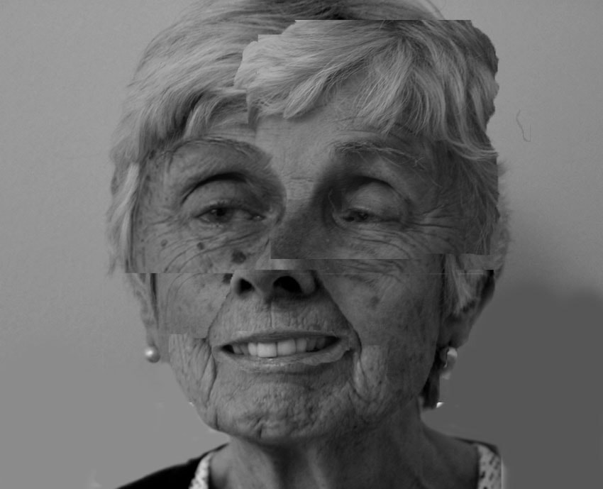
Brno del Zou


Brno Del Zou is a French artists born in 1963 who creates 'photosculptures' of faces. He does this by distorting them with many layers, all taken in different scales and angles to represent the 'chaotic side of our minds'. I chose to develop his work because I think he creates an abstract form of portraiture that shows more than one side to his models. Often in portrait photography images capture the most perfect or aesthetic sides of their appearance which can create damaging societal standards. I like how Brno looks deeper into each facial feature and creates more real portraits
|
|
|


Inspired by his work, I took pictures of my friends and family, close up into facial features and capturing each profile. I then used photoshop to try and merge these features from different angle into one portrait.

|

Initially I edited my pictures in colour to add vibrance however I found that the colour balance of each image was slightly different so it lacked continuity, I then used black and white and extenuated shadows to highlight the details on each facial feature. I found that when I mixed side profile with front on portraits it created an interesting affect that added layers to the face. When collaging the pictures I turned the capacity down to make the added images opaque soI could align them perfectly to the background however I decided to create a more abstract feel, I slightly changed the positioning and size of the images to create a more distorted looking face.

|
|
|


Leanne Staples
Leanne Staples began photography with 'photo tours' of New York City. She captures the urban life in the landscape city, documenting real life scenes. She takes her photos in an intuitive process with no pre intention of photos or anything being set up. This means that her photos reflect Manhatten in the realest form. I chose this artist to develop because she not only uses the medium of windows which I think makes affective reflections but also captures transport and plays with shutter speed to capture movement.


|

|
|
|

|
My first response to Leanne Staple's work was to look at her use of reflection to capture street portraits. I looked around my local environment through the lens of shop/ cafe windows to find interesting movement and characters. The images that I chose to use were when colours were vibrant and the people I were photographing looked somewhat disgruntled as I thought this captured the raw streets of London most affectively and prevented the images to looking fake or glamorised. I took my images on a sunny day so that reflections through the window would be clearer but I could still show some of what is inside.


