Brutalism
Brutalist architecture is an architectural style which emerged during the 1950s in the United Kingdom, among the reconstruction projects of the post-war era. Brutalist buildings are characterised by minimalist constructions that showcase the bare building materials and structural elements over decorative design. The style commonly makes use of exposed, unpainted concrete or brick, angular geometric shapes and a predominantly monochrome colour palette.
Simon Phipps

|

|
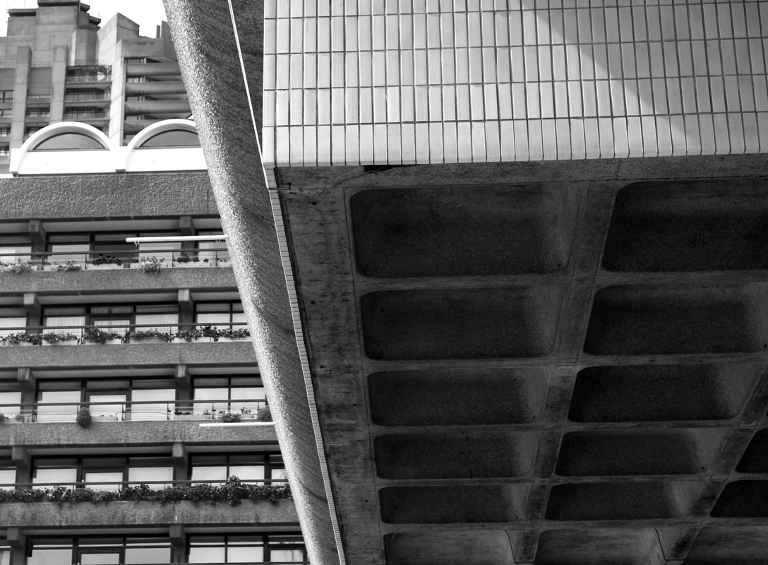
Simon Phipps is a fine art photographer operating in the UK, who studied Brutalist architecture. His concerns are to to document and present post 1945 modernist British architecture that (loosely) fits into the idea of the social contract, that the state would provide housing and municipal buildings for the people. This form of architecture followed from post-war financial issues where urgent housing was needed with little funds, so buildings were created using concrete. These designs face criticism and are frequently described as an 'eye sore'. His images are in black and white and often depict the solemnness of the country following the war.
|
My response


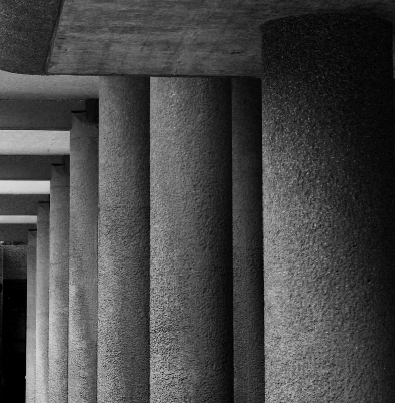
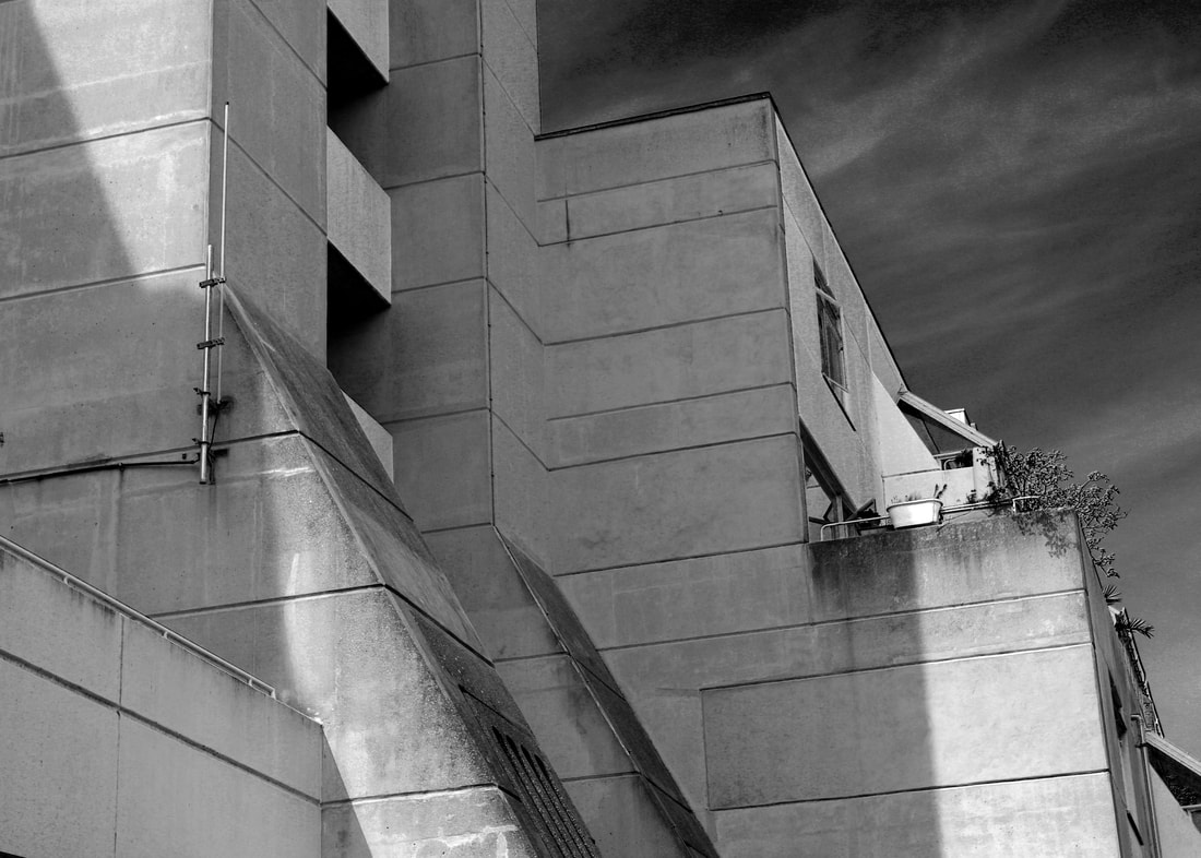
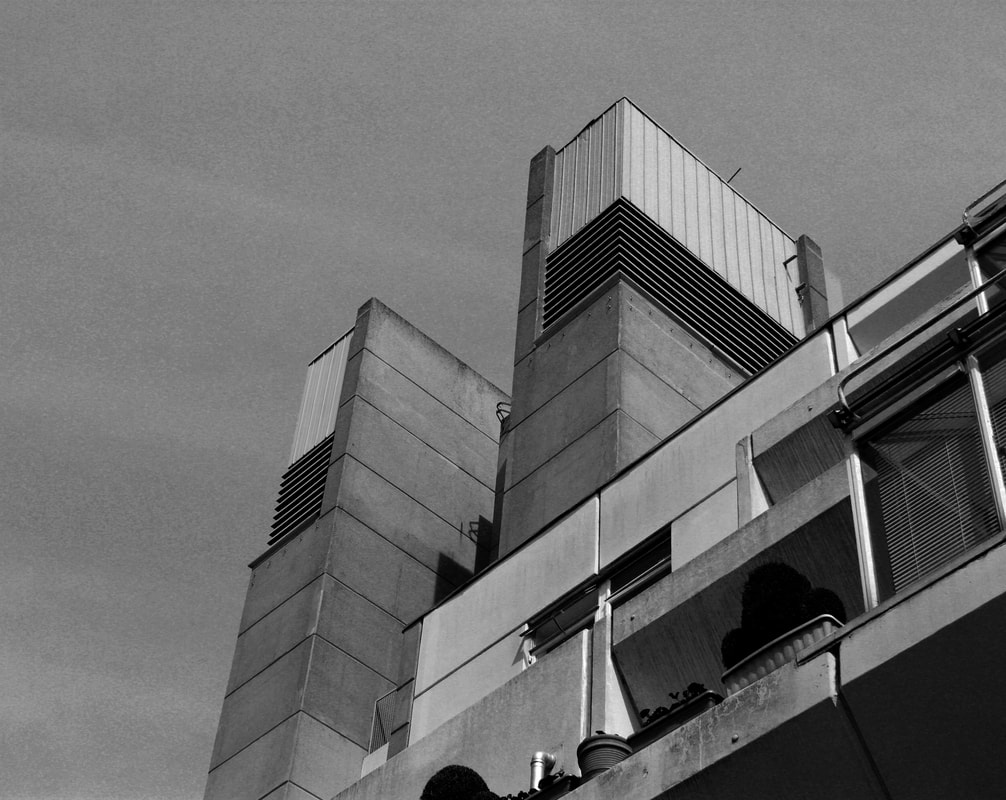
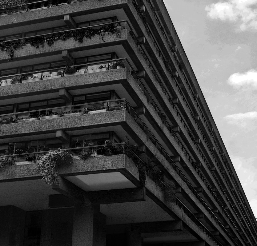
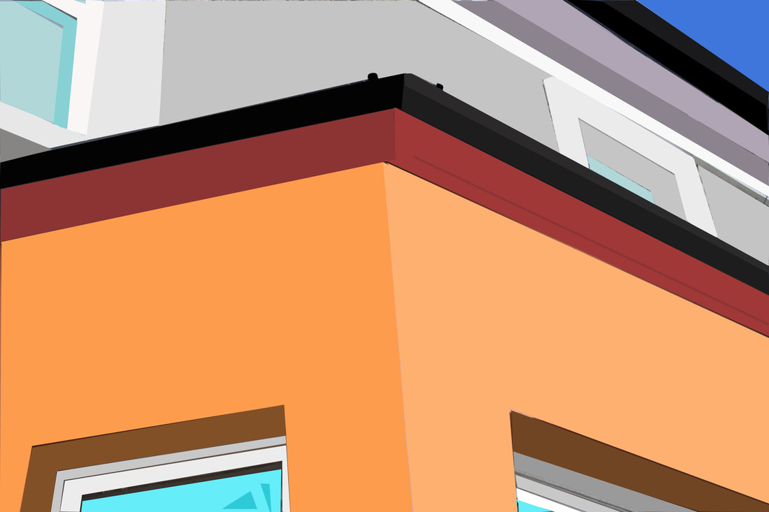
Following the work of Simon Phipps, I searched for Brutalist architecture that can be found in London. I photographed in the Barbican Centre and Brunswick Square. What I found challenging was that this type of architecture, that was once criticized for being unattractive on the eye, is now hubs for the public so I had to obscure the shops, people etc. When I was taking my images I was searching for line and perspective, form and shape, and negative spaces as shown below. I also wanted to capture the texture of concrete so I went up close and used the sunlight to create different shadows. Below are my best edits.
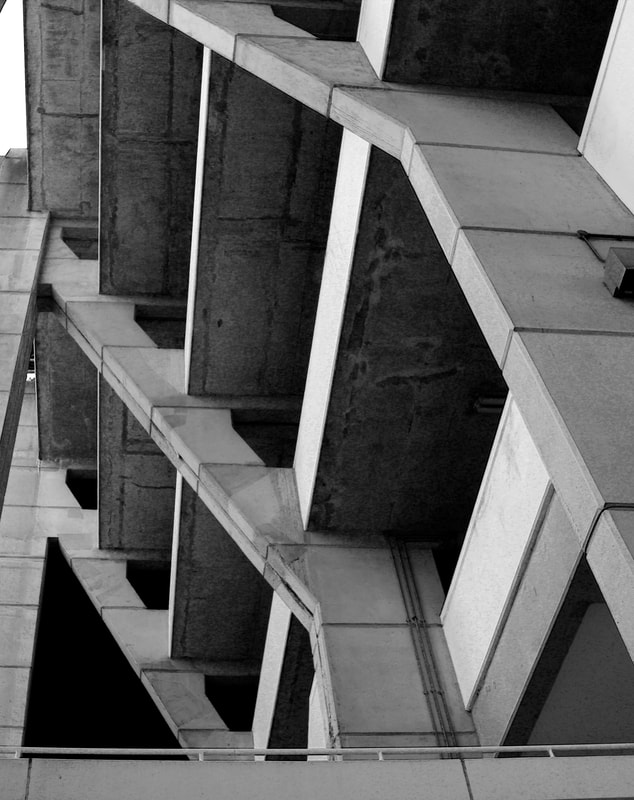
Line and perspective

|
|
Negative space
|
|
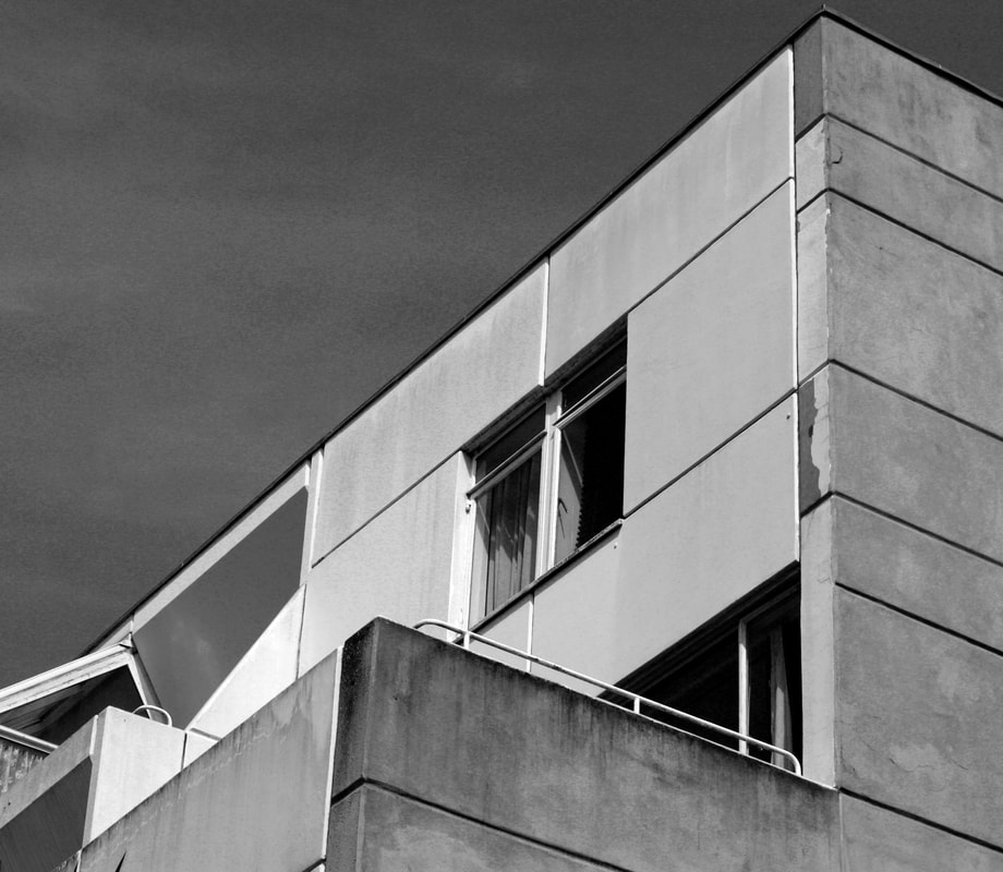
Form and shape
|
|
|

|
|
I cropped my images so there was not an overload of information and tried to use the pictures taken from below, looking up, that makes the buildings appear daunting and catches all the sharp angles and shapes. In Photoshop I edited my images so that the shadows were accentuated and there is a greater contrast of light and dark which is needed for photos in grayscale. I also edited the levels so the sky that looked bright appeared darker and gave the images a bleak feel.
Thomas Danthony

|
Thomas Danthony is a French illustrator who travelled to London to look at the architecture. He was particularly interested in the brutalism aspect, the harsh shapes of concrete and bricks that are formed in simplistic square shapes, which made it easy for him to block out the details and rusting of the buildings to simply capture shapes and shadows. His background edits the skies to pitch black which encapsulates the isolated nature of this style of architecture. The images are in grayscale and uses gradients of shades to show differences in shadows and light.
|
My response
I used my initial brutalist structure images from before to edit in the style of Thomas Danthony. To do this I first put the picture into black and white to remove excess detail. Then in Photoshop I selected the shapes and filled them in with the corresponding shade, trying to keep the original images depiction of shadows. I tried to keep as much of the detail in to show how brutalist architecture appears, which proved difficult because there were a lot of intricate shapes to select.

|

|

I think the most successful image is the bottom one, as it is taken from far away so captures a full sense of brutalist architecture with a lot of detail. It also has simpler blocks of shadows which make the image look more edited. For this image I didn't fill the sky to black, like the earlier ones and those of Thomas Danthony ,because I felt the architecture stood out much more on a white background given the darker hue.
Johnny Kerr
|
|
Johnny Kerr explores structure and architecture in a more futuristic way, photographing bright bold colours. He highlights perspective through the positioning of shadows and creates simple structure forms.
|


I replicated this work through photographing architecture with the intention of emphasizing lines and space. I then put these images into Photoshop, highlighting the shapes and filling in with block colours. My intention for my first image (below right) to play with colours and shades to add perception and shadows and create a bright simple piece. My second response (below left) was more detailed and I used already bright hues in the image.
|
|
I think these images were successful in terms of choice of colour representing the tones in the image, however they could have been improved with further attention to detail making sharper, more consistent shapes.
Twisted Structure
Nicholas Kennedy Sitton
|
|
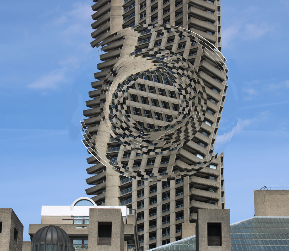
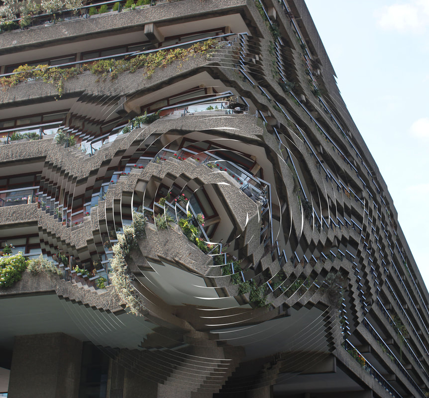
Nicholas Kennedy Sitton is a master of photo manipulation, taking images of typical urban structures and then twisting them to create something that is at once beautiful and almost impossible to recognize. Whilst Sitton leaves much of the original image untouched, selections of the buildings have been rotated making the scene look like it’s spiraling into itself causing an almost hypnotic feeling. There is a contrast between the fantasy of distortion and disorientation, and the otherwise typical scene
|


My response
I distorted my own images in the style of NKS. The most effective architectures to distort were tall, layered buildings as they make a more spiraling, optical illusion. I wanted to keep the block blue skies and colours but distort the shapes of the buildings, tricking the eye in a dizzy sense.
|
|
|
To create this affect, in Photoshop I selected circles from my original image, rotated it slightly and then selected a smaller circle within the circle, repeating this multiple times. As I got further into the circles I made the gaps in between larger to make the buildings curvy. I think the image on the right is particularly successful because it was originally straight block lines and they became wavy.
Structure in Nature
Myoung Ho Lee
|
|
Myoung Ho Lee is known for having created a mixed media project that enhances the charm of nature by capturing single trees on rectangular white backdrops, which compose a series of still life called Tree. The project is built on the decontextualization of natural elements made by installations using a white cloth and depicting a wide range of tree species in different seasons and hours of the day. He uses rule of thirds for the placement backdrop making the images more aesthetically pleasing.
|


My response
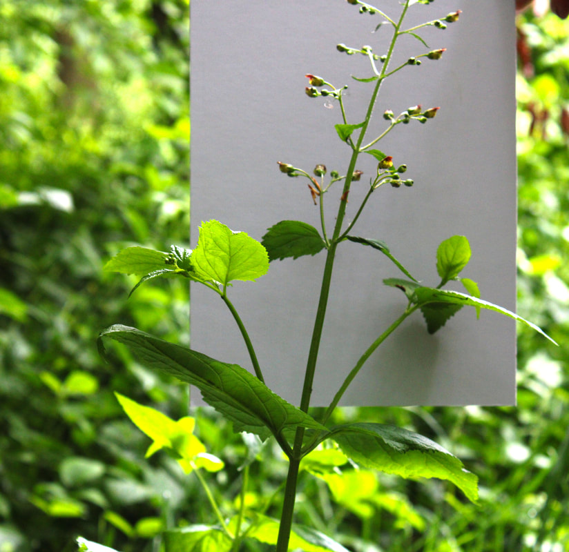
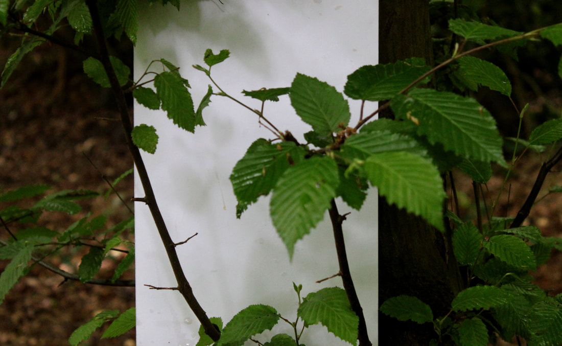
In response to Lee's work, I went into my local woods with simply a piece of card. As Lee uses large scale backdrops and his work often involves cranes, I could not replicate on the same level but wanted to use his ideas in photographing smaller parts of nature. I tried to balance the pieces of cards behind plants to single out the most interesting parts. I also tried to use shadows and lighting to create dappled effects.


Best edits-
|

|

|
My best images were those where the sunlight was behind the flow/ stem to make it look crisp against the white backdrop. I tried to enhance this in Photoshop and exaggerate the colours. I think it works well when the bushes behind were in shot as it makes the subject in front of the white look isolated to the rest of the background.

|

|
The images above are where I tried to create dappled lighting and shadows with the scattered nature of the leaves. I also experimented with tracing paper so create a see-through effect.
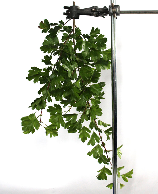
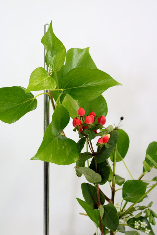
Sanna Kannisto
|
|
Sanna Kannisto uses nature in a man-made set up, highlighting the contrast with bursting life restricted by a clamp under bright fluorescent lighting. This draws in the eye by isolating certain pieces of nature from the rest of it's habitat.
|


For this task, I used a combination of scientific equipment like clamp and natural objects like exotic flowers to embody Kanistos work. I paired different leaves and flowers together to create arrangements of them and tried to create placements in the most natural form to appear how they would in the environment

|


|

|
|
|
I think that this project was successful because the nature appears to burst with life, almost as though it is breaking the constraints of the clamps. The white background illuminates the colours and I achieved this vibrant effect well.
Nature vs. human form
Alicija Brodowicz
|
|
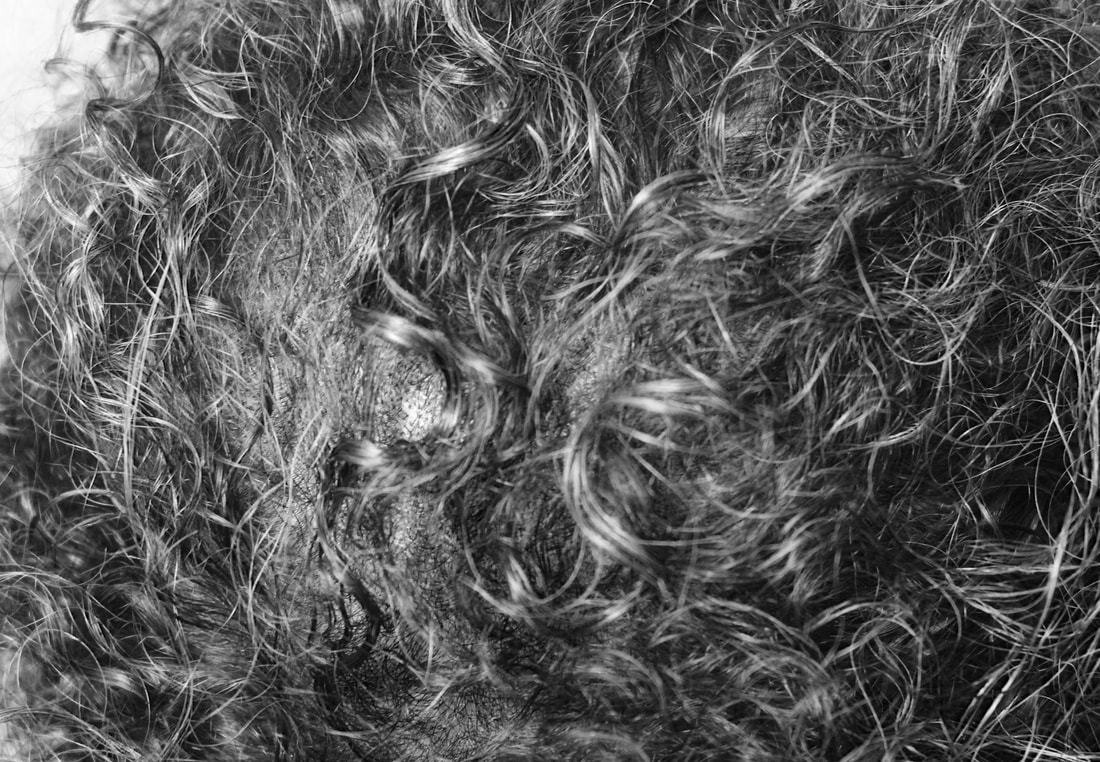
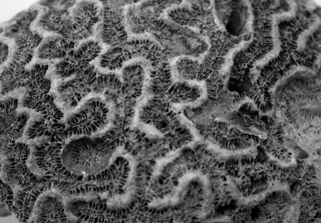
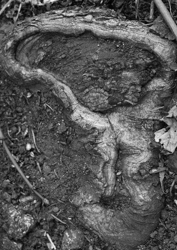
Alicja Brodowicz is a Polish photographer who is known for her experimentation of combining the two elements of nature and the body. By combining these two elements she attempts to find similarities, often looking for features such as converging lines, textures in the layout. By doing this she is focusing on finding unity between the human body and nature.
|


This task compared the structure of body and nature, looking at the similarities between the two. I began this by exploring my natural surroundings and was surprised by the amount of bodily features hidden within the environment. I then tried to replicate these images with the people around me and their bodies. I turned the pictures into black and white to mute the differences in the images to purely focus and forms and structures
|
|

|

|
|

|

|

|

|
|
The images above are my best edits- put together with their matching image. I think this was a successful depiction of human form and nature combined, and the portrait pictures successfully mimicked the originals from nature.
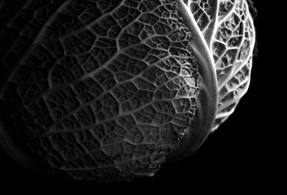
Edward Weston
Following from the structure of nature, we looked at the work of Edward Weston who specialises in fruit and vegetables. He creates dark unclear images in black and white that reflects a different perspective on everyday fruit and veg

This photo is Ed Weston's most famous image, it is probably successful because of his manipulation of light and shape. The bell pepper looks distorted and it is not clear at first glance what the image is of.
|

This photo is of a dissected cabbage. It creates a deep perspective into inside the vegetable and highlights each detail and crease.
|


To mimic his work, I gathered the most intricate fruit and vegetables around me and placed on a black background. My focus for this response was lighting and shadows. I wanted to fully capture the structure and detail in my photograph so used artificial lighting of torches and lamps, aiming to cast shadows and highlight each specifity.

|

|
|

|

|

|
I think these images were successful because they depict the texture of the different items. The shadows created an abstract feel to the images which makes it harder to tell what the image is of, reflecting the work of Ed Weston. The images could be improved by a greater contrast given that the images are in black and white there would be a greater metaphysical feel.
Independent development-
When progressing into my independent study, I wanted to focus on the two elements that I believe best replicate the word structure- societal structure and architectural. I aimed to explore these through street photography and surrealist collaging and then to create a final piece using both factors that best described my interpretation of the theme structure.
Societal structure
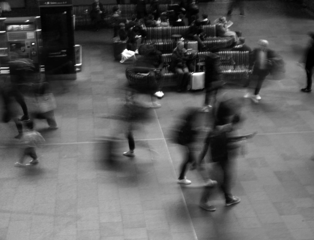
My next strand of structure was investigating the individuals in society, highlighting both similarities and differences. I started street photography, simply capturing the public embarking on everyday routine, particularly trying to capture the head-down nature of Londoners going about their business.


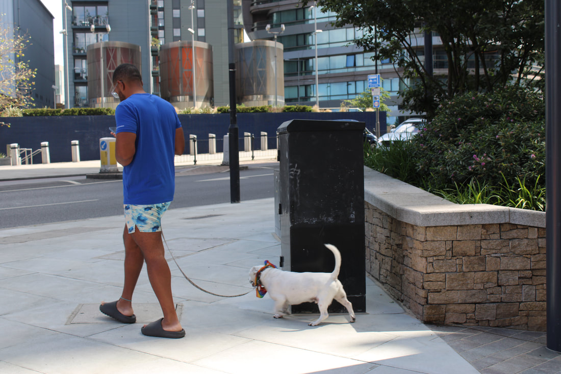


This was a successful first response to introduce me into the practice of street photography as it can sometimes be an awkward motion, especially perfecting the frame of the image while in a fast-moving environment. However to develop these I had to study artists that would help me create more meaningful pieces.
Saul Leiter
|
|
Saul Leiter was an American photographer in the 1940s and 50s who recognised New York as the base for street photography. He photographed in colour using slide film such as Kodachrome which was revolutionary for his time. He particularly accentuates the reds and yellows of his images which creates a sense of life, capturing the busting streets. His images are framed in an abstract way so that it captures more of a feeling rather than an exact depiction of the scenes
|


|
|
When replicating his work, I had structure and composition of my images in mind. I wanted to position my camera to capture reflections through windows and door frames and capture people in their everyday lives. I also had in mind reflections so when I photographed it was a sunny day to make them clear, and experimented with both greatly contrasting reflections to what is inside and coordinating ones, like making people on the street appear to be inside where I was photographing
|

|

|

|

|
When editing images, I had to crop the frame to ensure my reflection was not visible and aimed to make particular characters the subject of the piece. As done in the work of Leiter, I heightened the colour saturation of the pictures to create a more vibrant appearing scene. I believe my most successful image to be the top right as it focusses in on one subject to the image, which creates an intriguing aspect and focuses the photo.
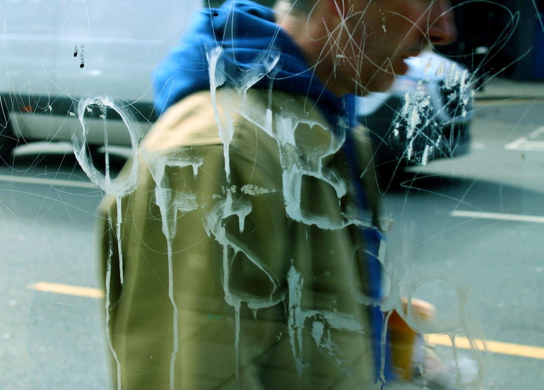
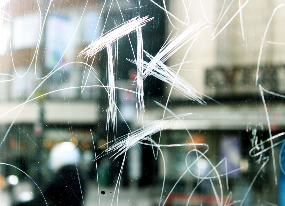
Stephen Calcutt
|
|
Stephen Calcutt is a street photographer who explores Birmingham to capture a real sense of his area. He uses etchings and graffiti of bus stops to frame his art. The violent shapes dented on the environment represents anger and frustration which he uses as a theme for his work. The graffiti is his lens on which he focuses and blurs the rest of the image. It reflects a new perspective on street photography as the picture is framed with this mood of anger.
|


|
|
In my attempt to mimic Stephen Calcutt's work, I explored my local area looking for graffiti and scratches in glass bus stops. This creates a damaged foreground which can highlight some of the less glamorous parts of high streets, creating a more honest form of street photography. I stood behind the glass waiting for people to walk past to frame the image. It was essential that people did not know they were being photographed until afterwards so that the photos did not look forced or candid. I had to set the aperture higher so that although the bus stop glass was the focus for the image it still captured all of the background clearly. This task challenged me because I only had a split second to capture people walking past, so had limited time to frame the images. Below are my best edits-
|

|

|
|
|
I think these images were successful because they captured a raw sense of people completing everyday tasks. The scratchings on bus stops caught the light in the dents of the glass which adds texture and depth to the images. The top two photos I colour balanced in Photoshop, heightening the greens, in order to make the images look more analogue. I think those images were my most successful because the foreground of the bus stop graffiti is fully focussed, while what is captured behind the glass is more blurred, but still fully depicts the scenery around. I think that the images in the second row, although capturing a raw depiction of people, are less good because the background was too busy so there is no clear focus of the image. Also the markings of the glass were not in as clear focus so some reflection was captured and the photos became more ambiguous with less of a focal point.
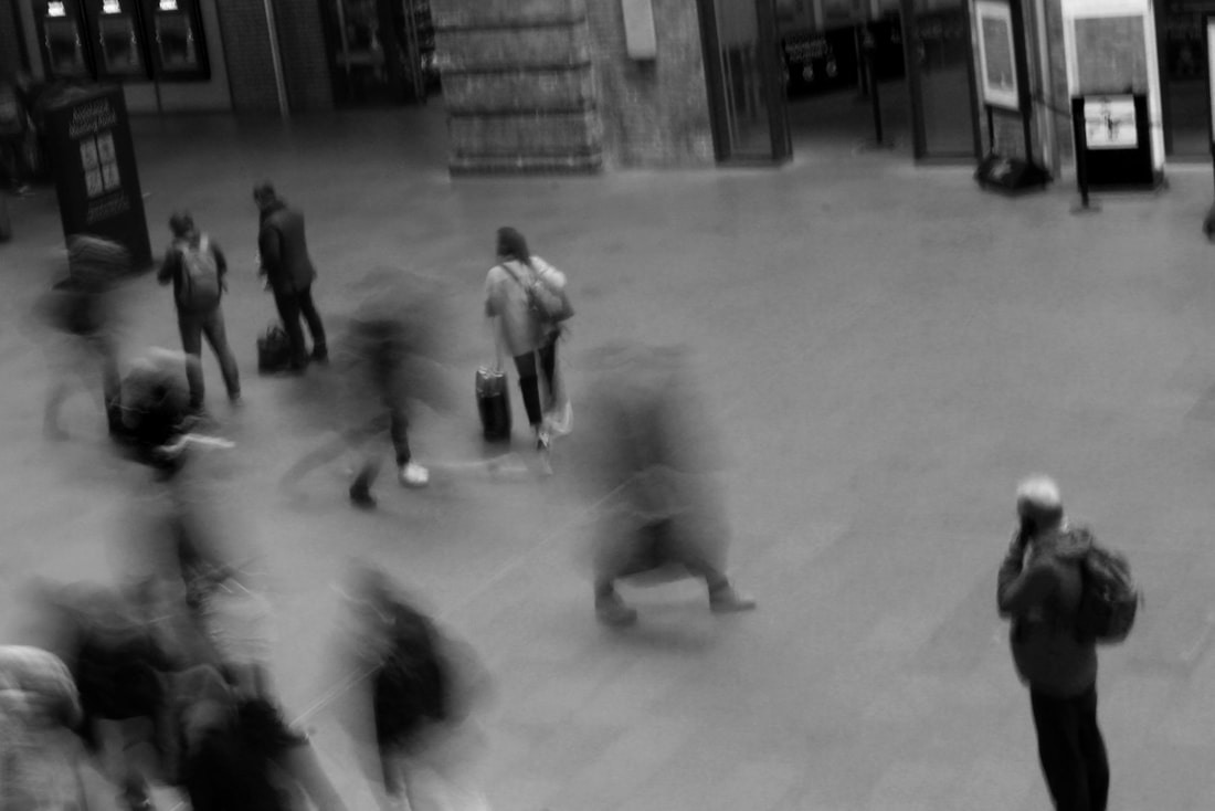
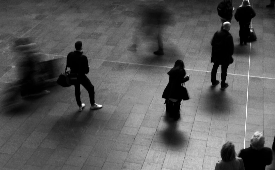
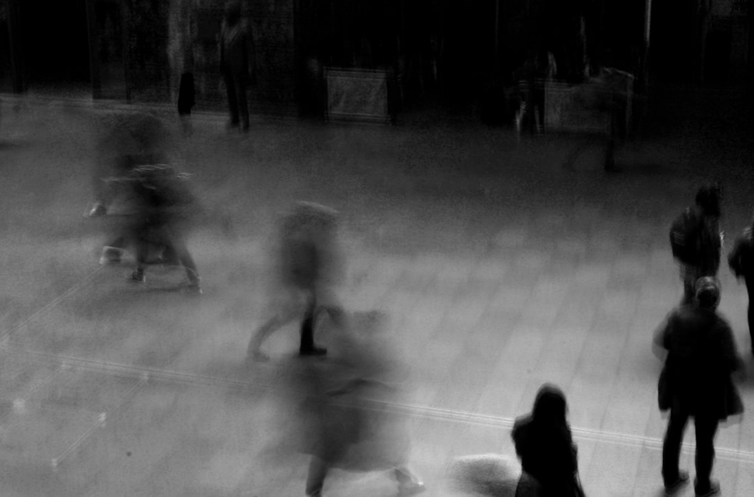
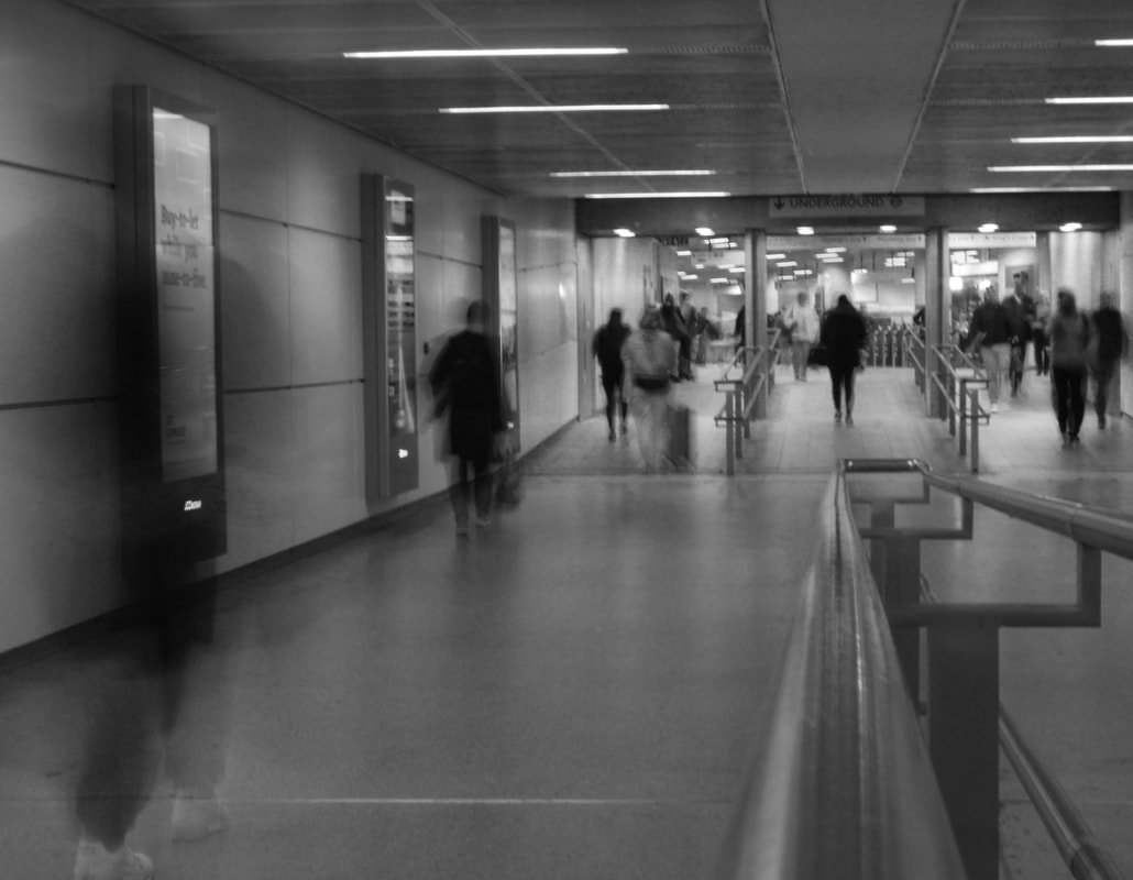
Alexander Titarensky
|
|
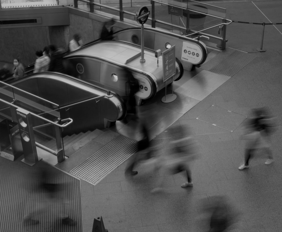
Titarensky takes time-lapse style images with a slow shutter speed that highlights the fast paced movement of humans and crowds. The images are effective because certain subjects are in focus while others are blurred and moving.
|


|
|
To create my response I went to King's Cross train station which is infamous for it's hustle and bustle but also is home to those passing hours of idly waiting in one position, which was perfect for my contrast of movement and stillness. However I did not have a tripod so had to set up the camera rested against a table, bar etc. limiting my ability to control my frame of image because of the slow shutter speed. In images where the camera was not securely rested, the pictures were shaky. It also turned out to be very varied how interesting the frame of image would be because of the constant flow of people and sometimes empty spaces so I ended up waiting to get my images.
|
|
|
|
|
|
|
My best edits above are successful in demonstrating movement with the blurred shadows. I think the camera settings were just right to keep the still people in clear image, but show the path of the people moving. I edited the pictures into black and white because the pictures were slightly over exposed so I had to reduce the brightness and create silhouette type figures.
Surrealism structure
For my third stand of structure, I wanted to look at architecture as before but in a more abstract way. I looked at surrealist artists who create collages, contrasting different forms of architecture and building works to create eye-catching images. I used a variety of brutalist structures, modern and everyday, classic architecture such as garages and petrol stations.
Beomsik Won

|

|

|
Beomsik Won depicts structure and surrealism in an intricate form of 'deconstruction and construction'. I like his images because they play with layers and angles to deceive the viewer and contradict the typical form and shape of architecture. The way in which he constructs a new building is fascinating. It also compares cultures of different areas, where you might find different forms and structures. His images are all in black and white which I decided to do in my pictures so that there is less information differencing from each image and they blend together better. However Won uses a plain landscape before he creates his images, with the horizon being on show, I chose not to do this and instead took a more collage approach. I collected my images and placed one building as the background. I then got my more interestingly shaped structures and cut them out on Photoshop, pasting them onto my background. I had to play around with perspective and layering so the images were abstract but also retaining order. I think they became most successful when the naturally larger buildings were placed with smaller ones or looked like they were part of another building to put off the natural sense of sizing, conforming to surrealist style.
|
|
|
When taking my images, I wanted to incorporate particularly brutalist and Victorian structures and images taken from below so that the buildings would appear slightly daunting and intricate patterns
|

|

|

|
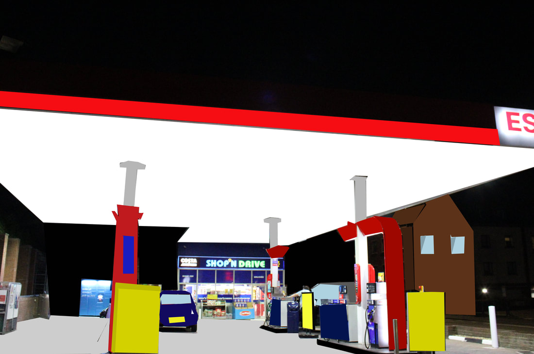
Although placing my images in black and white removed the possibility of too much information I think it created dark, and uneasy to read images. I think they were successful in playing with shadow and form particularly the picture on the left. I used a combination of modern buildings taken in the City of London, brutalist architecture taken in Brunswick Square and Victorian structures. This mergence of shapes creates contrast and a lack of distinction. This makes you look deeper into the picture and highlights the affect of architecture. I think the image directly above is successful because the petrol station creates a unique shape and the fluorescent lights counteract the bland lighting on the other images. I slanted the brick building to layer the shapes and frame the picture. The top left image proved the most challenging to edit as the images used were all fairly rectangular shapes so I wanted some overlapping. This meant I had to cut layers carefully. Two of the layers were from the same building, one far away of the exterior and the second a closer look into the interior of a garage. This makes it interesting as putting the two layers together shows how perspective can differ however not many different shapes were used.
|
'Cubism on paper'
In response to my structure development looking at architectural collages, I decided not having a plain background made my images cluttered and messy. Going forward I looked at the workings of Jaime Travezan and used my images of more modern architecture to make my images more crisp.
When taking my images, I kept in mind the surreal effect I was trying to recreate and to keep the entire building in shot when possible so it could be cut and pasted
When taking my images, I kept in mind the surreal effect I was trying to recreate and to keep the entire building in shot when possible so it could be cut and pasted
Jaime Travezan

|

|
Jaime Travezan creates his own shapes and structures, simply by using the works of architectures as his material. He makes collages in a much more organised, routine way by capturing a handful of images from daunting angles and mirroring and reflecting them by copying onto one large collage. The image on the left captures more modern architecture and the right being older, brutalist structures. I decided to base the majority of my image off modern architecture as the colours are relatively similar, so putting my images in black and white was not essential. I thought it therefore allowed for more differentiation in shapes and forms. Through my collages, I wanted to represent multiple different aspects of architecture by the way I placed the buildings. In order to create these, in Photoshop I began with a blank white canvas and I cut and pasted my various images on, experimenting with angles to make interesting formations
|
|
|
I set out my intentions for the project as to explore skyscrapers and went to the City of London. When photographing, given the crowded nature I found it challenging to find an angle that
|
Architectural detail

|

|
The images above were my first go at editing. The one on the left best represents Jaime Travezan. I created a spiral affect layering my images into a circular motion. I decided to keep the image in colour as all photos were taken on one go so there was little differentiation in light and shadow and all the intricate designs were demonstrated more effectively in colour.

This image above was my independent take of Travezan's work, somewhat creating the inverse spiral effect. This proved more challenging to successfully create but my intention was to make the structures appear daunting and looming.

|
My final editing response I believe to be my most successful, I honed in more on shape and structure to remain abstract but respond to the shape of the architecture rather than arbitrary shapes like the circular motion created before. This allowed me to be more creative with how I constructed my collage and enhanced my understanding of structures.
|

The image above I believe to be my most successful from the entire development. I incorporated all the most interesting structures I had photographed and was not overly focussed on the architectural aspect, so had an enhanced focus on things like staircases and windows which helped me create a futuristic, surrealist design with the images I had taken rather than simply a collage.
Final development
My next development using the skills learnt was to create a more refined collage that represented specific areas, to invoke nostalgia and look at human life, not just the structural architecture. I did this by photographing shops, buildings and people to create a collage of these areas with the things that best represented them.
|
|
When taking my images, adapting from the difficulties that I had discovered in my last project, I aimed to photograph mainly simple structures and have the whole subject in frame so it could be extracted from it's surroundings and still appear functioning. In order to make my collage flow and coordinate, I photographed roads, roundabouts and allyways to be the base upon which I pasted the local 'landmarks' on top of. I also wanted to capture all the elements of this area so photographed anything I found that makes up an area like cars, motorbikes and traffic lights.
|

|
FinchelyMy first response was to look at my immediate local environment, particularly my high street as it contains the most designs and culture but I also photographed the local streets to create a sense of neighbourhood. Out of everything I had to capture I chose to focus my attention on the classic everyday shops, such as the corner shop and KFC that would be evocative and create a sense of locality.
|
Muswell HillThe next area I explored was Muswell Hill. This is best described by independent coffee shops and colour and life so the images that I took aimed to replicate this. I think this response was more successful because my editing process was more careful and I produced a coherent product because of my attempts to structure my images where they would belong ie. the car placed at the roundabout but keeping abstract ideas through sizing.
|

|
Central London
My final piece used the City of London. I think this was the easiest area to represent as it has so many landmark features that invoke nostalgia. I think this was successful because I curated my own skyline using the images and incorporated tubes and buses that are instantly known as features of the city, as well as portrait pieces of businessmen. My centre point for the collage was a bridge across the Thames, allowing a basis to then create my landscape. Most of my pictures of the skyline were taken from below which I think enhances the effect of the big city by looming buildings above however it was challenging to get it all in shot, being so large.

My collages were largely successful because of my learnings about surrealism which allowed me to experiment with perspective and create more abstract work. The white background creates a simple basis on which to paste my images and create a futuristic take on a recognisable environment. I achieved my aim set out at the beginning of my independent development of merging the two elements (architectural and societal) of structure into a synchronised and refined piece of landscape and portrait photography combined.
